Color Block Simplicity
Painting with more color and keeping the art as simple as possible. A series of of steps outlined just for you!
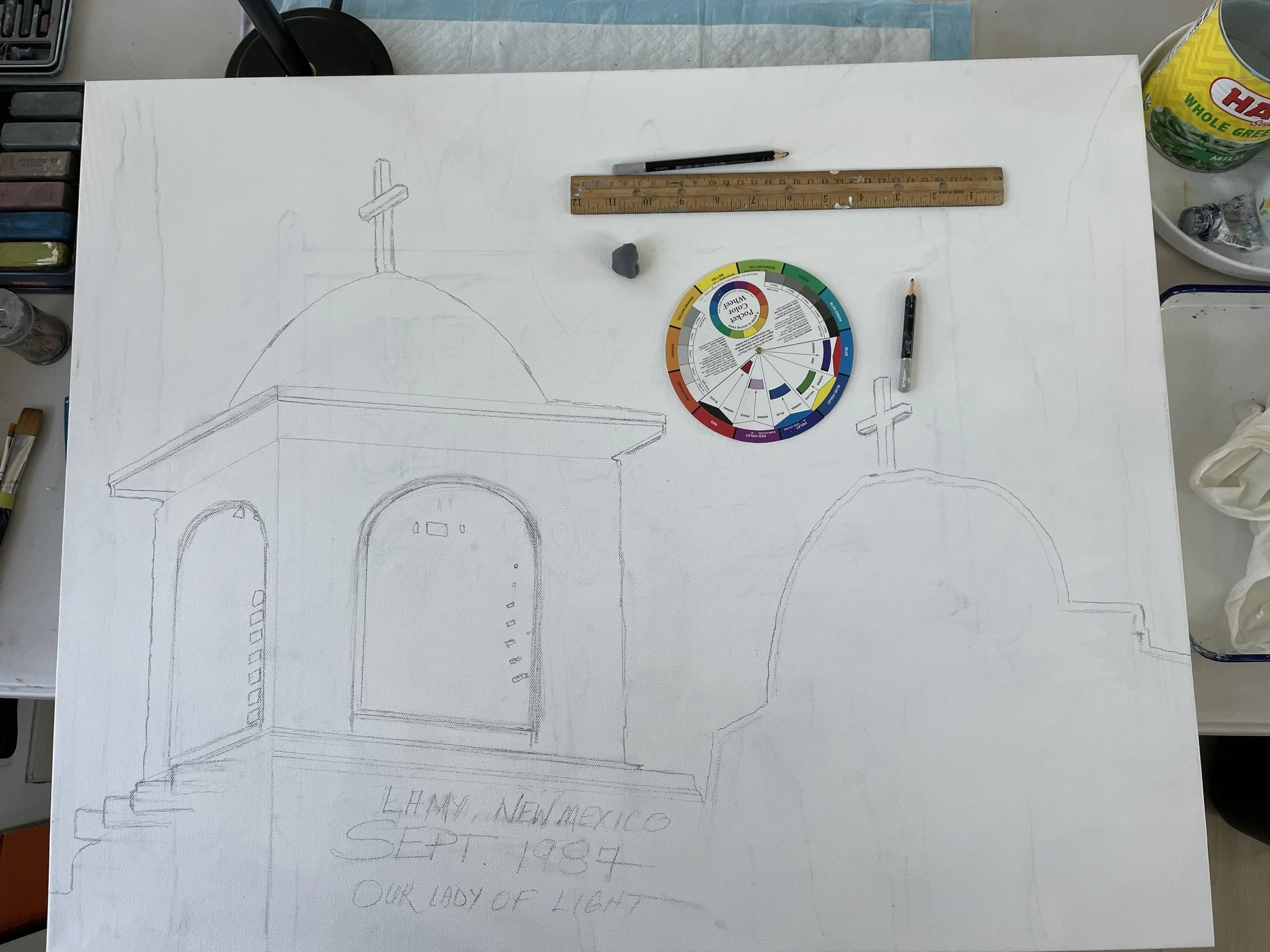
In the video above I show my preliminary drawing of the painting I am creating from an archived photo I took in 1987 at Lamy, New Mexico. This is a focused shot centered on the top of the front of the Catholic Church Our Lady of Light. The scene was backlit with bright white in the lower sky and the building was black except for the light peaking through the belfry wooden slots that were rotting out pretty quickly during this era.
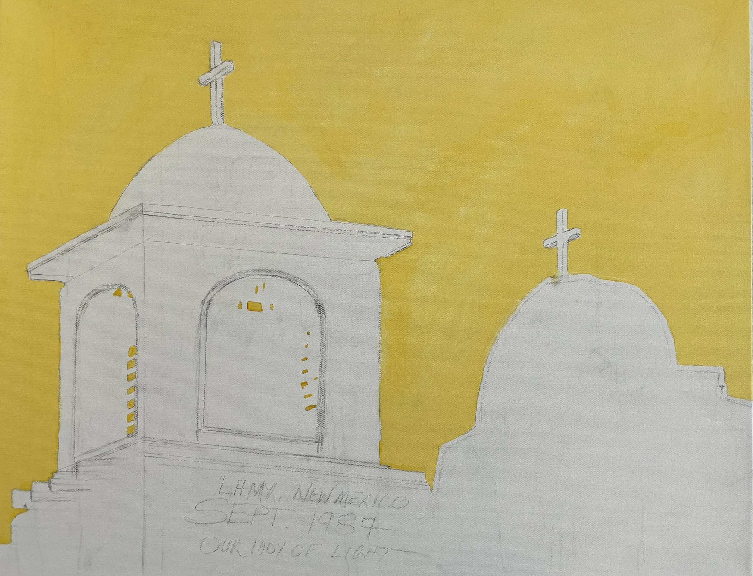
Although I love to make very loose almost abstract landscapes, when I get to drawing or sketching I get over detailed in capturing the details. I draw, and draw, and keep drawing until I forget. This sketch was for the painting! I’m not trying to make a large drawing!
Recently I decided to attempt to loosen up my drawing, simplify my painting, and add a lot more color. I had some colors in mind since I like green-gold diluted in titanium white, yellow and yellow-orange AZO, almost any blue diluted with titanium white, and I have always, always, tried to add red somewhere in every painting.
Please check ou my video of the drawing and color wheel at big decision time. Picking the colors! Then you can step though my painting as I progressed for the next two days. My finished painting is listed here on this website too. Check it out.
Thanks for viewing!

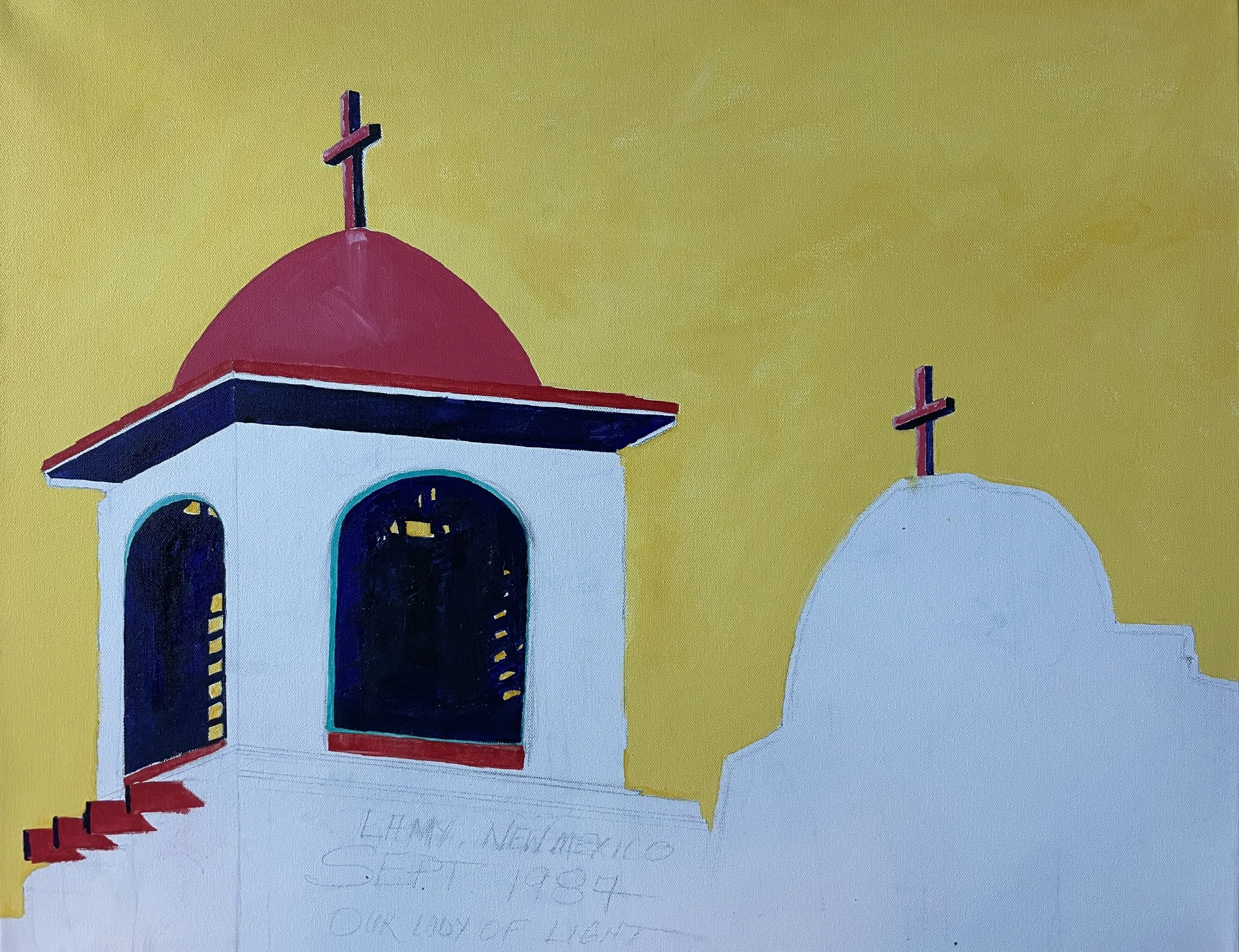
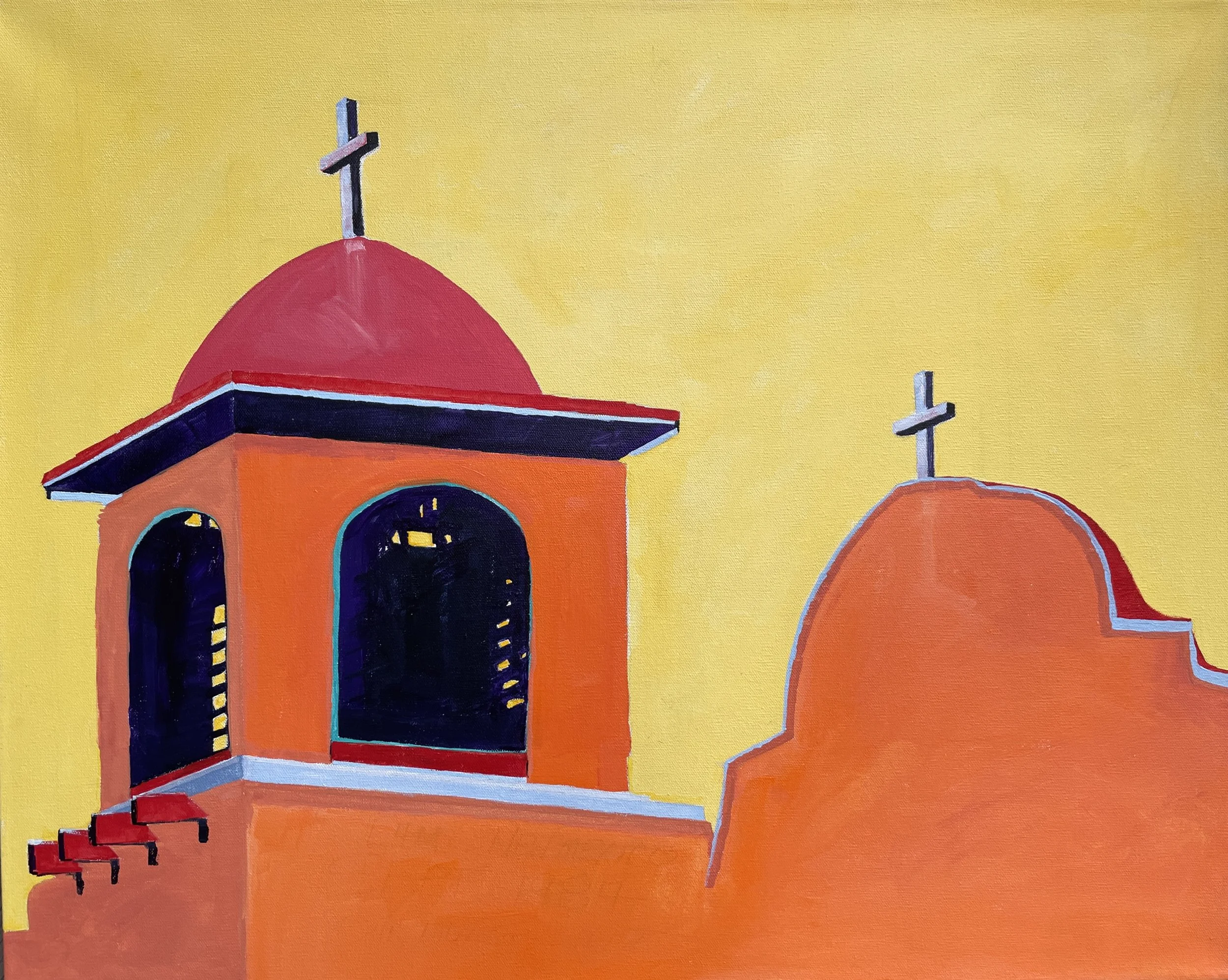
Our Lady of Light in Lamy New Mexico painted in acrylics on a 24” X 30” X 1.5” Stretched Gallery Wrap Canvas

Secrets to Painting a Successful Landscape on Synthetic Yupo Paper
The Herd a paining on Yupo Paper 11” X 14”
Mixed media acrylics, acrylic inks, charcoal, pencil, and soft pastels on synthetic polypropylene paper.
Painted on 8/12/25
If you have been keeping up with my blogs you know I am very creative and love to experiment with new types of art paper surfaces. I have received some great feedback. I guess it all started for me when I used up all my mixed media paper and had to resort to ordering pads on-line due to local supply. This led me to try some economical paper called Artfinity Synthesis Paper made of a mixture of plastics. When that supply ran out, I tried Yupo polypropylene paper. Then, I came upon Mineral Papers made of calcium carbonate at a local Meiningers Art Supply in Colorado Springs by accident looking for synthetic papers. I am a real fan of these mineral papers, but today I am discussing techniques to use on the Yupo polypropylene paper.
Yupo synthetic paper is such a cool surface to paint on! It is non-wetting, so color pigments don’t really get into the surface, if at all. A non-wetting surface has its own challenges. Aqueous solutions of any types bead-up on the surface and can’t be controlled with a brush stroke. The greatest thing about a non-wetting surface is…. IT DOES NOT BUCKLE or WARP! Being a plastic material is is foldable, rollable, and pretty indestructible in nature. I don’t see a lot of people painting on these papers, but the ones I have seen use a different technique than I use and don’t seem to have considered my process. That’s what I want to pass along.
First of all I prefer the Artfininty Synthesis paper to Yupo paper because it is slightly whiter. I am picky. I tape the synthetic paper on a smooth birch panel slightly larger than the paper size using 1/8” wide artist masking tape. I really press the tape down to keep it from leaking under the paper. The tape is wetting, so this can happen. I also ready my supplies. I like to use a small shallow metal butcher pan to hold my paints. I like to add several rows of titanium white heavy body paint to one end. Then, I add acrylic inks or acrylic paints in areas I want to mix with the white rows to make skies, mid-ground, or near-ground effects with the blue, browns, and yellows.
I start off marking a horizontal line with a pencil that is not in the center of the paper. This is just my reference for a level landscape and a reminder of where the center of the painting is located. I like to start off in the middle area to make mountains, hills, trees, etc. and work from there. To begin I dilute the color chozen with thick titanium white even is it starts off as an ink consistency. This thick blend will adhere to the Yupo paper surface and stay where you put it. Before it dries, or if you have to dilute it with a little water if it becomes too thick, you can spread the color around. Going back over drying mixtures could pickup the entire blend and leave the paper white surface where you put down your first color. Don’t rework this too much, unless you intend this effect. You can take a palette knife and remove lines or shapes from the surface before it dries, which is a nice attribute.
Blends of any pigment with heavy body acrylic paint will dry pretty quickly on the Yupo surface! While it is wet you can get some great effects using sprays of alcohol, drips of water, or your own creative ideas. After it has dried, you can remove the entire painting or parts of it with 91% isopropyl alcohol and/or water.
I like to finish off my paintings with touches of Sennelier soft pastels. You will see evidence of that is almost every painting of mine. There are so many creative ways to use these synthetic non-wetting papers

The Magic of Mineral Papers for Mixed Media Paintings
I like experimenting with new art materials and being highly creative I will find a way to use these materials to my advantage. The things I like about Mineral Papers are (1) they are made from calcium carbonate, the mineral, and are (2) non-wetting making for great multi-media play, and (3) they do not warp with water or alcohol use. But best of all these papers can be shipped easily because they are tough and lay flat.
My papers are from Yasutomo and are 6” X 8” in a 20-count pad. This was the starting point for my experimentation. I would love to try some larger sizes now that I realize the potential of the material. I had never seen or heard of these before I purchased them last month in Colorado Springs at the large art supply store.
One thing I have not seen anyone else doing with their art on mineral papers like I do is applying a thickener of pure titanium white acrylic paint to my acrylic inks. I learned this from a lot of experience with Artfinity Synthesis and Yupo Synthetic papers which are mixtures of plastics and polypropylene. The feeling of painting on Mineral Paper is very similar to painting on these other papers. I will share some of those experiences with you later, with images to demonstrate the results of painting on synthetic papers.
If you have any experience with Mineral Paper, or other synthetic papers drop me a note!
Later!

Secrets of success for painting on Mixed Media Mineral Papers
Awesome skies over a yellow field with trees in a small creek nearby. A high value painting with a grabbing foreground and inspiring outdoor landscape scene. Painted with mixed media including acrylic inks and heavy body pigment, soft pastels, pencil, and charcoals.
Get ready for an introduction to a different kind of paper, if you have not already tried painting on Mineral Papers.
Visiting the local art store in Colorado Springs recently, I wanted to pick up some new surfaces to paint on. I prefer to relax into non-representative landscape painting with my coffee each morning. Having run out of paper I was thinking of getting some more 180# or greater mixed-media acid free paper in a 11” X 14” size. I didn’t make it to the traditional papers, but got stopped when I saw the Yupo polypropylene paper tablets I had recently experimented with. Next to it was Yasutomo Multi Media Mineral Paper.
The description on the cover of the 20-sheet pad said it was 6” X 8” (15.2 X 20.3 cm) 100-lb and made from calcium carbonate providing a unique texture for water based or dry media. This paper is Waterproof, Tear Resistant, and Foldable. I would add it is a translucent bright white vellum surface that is acid free.
Wow, what fun to paint on! This Mineral Paper is perfect for me. If anything I’d like some really large sheets to make wrap-around art I could backlight as a lamp! But, since I have been painting a lot on Artfinity Synthesis synthetic paper and Yupo synthetic paper, it just was not that different.
I hope I can provide you with a new technique that I have not witnessed on Youtube or anywhere by anyone else. My secret for success with all these synthetic papers is to provide a means to keep the pigment on the paper without it running or bleeding at random. Some of the randomness of it’s non-wetting properties are great, but I want a little more control over my art.
My secret is to use heavy body acrylic paint, typically a thick Golden brand professional titanium white from a tube. It is thicker than cheaper and other titanium white acrylics, not that they won’t work, but I like a guaranteed product. I place two long rows of the titanium white hb acrylic in my butcher pan. I use a lot of it. Then I dropper in smaller amounts of the acrylic inks I am going to use for the sky and foreground. Say, use three-four drops away from each other and the white. I blend the white hb acrylic with the acrylic inks in seperate areas away from each other to keep my blues away from my ground colors.
These pigments will not brush right on the Mineral Paper and will stick just like painting on regular mixed-media paper. If you plan to backlight. Be aware of every stroke as they show up looking through the vellum. If not, paint on and enjoy the process.
I use a big brush 1.5-2” wide watercolor style for laying in the sky and center ground-levels, but want to add some new value change at the foreground that draws you in to the front of the painting. As you can see from my art, good values are my most important goal in completing a painting, but also always on my mind whether it’s skies or fields I am painting. So, I take acrylic ink bottles with dark browns, black, indigo, or squeeze pure Payne’s Gray out right on the surface undiluted in a horizontal line typically. I get the maximum water loaded in the big brush and drag it across the paper letting it bleed and run. This can be very intriguing and you may want to let it be? But, there’s more. I spray this bottom section I just put down with 91% isopropyl alcohol and wow, it really bubbles up and runs around. At this point I like to add my input via a spatula, a 8b pencil, or the bottom of the large brush handle to direct the foreground into something I recognize. I might even grab a soft pastel and use it on the surface. I might grab some charcoal and do the same. This is the completion phase.
I hope you can give this a try and let me know how it went. Have fun!!

Painting Improved with Photoshop Elements Modification? Opinions?
Last week I painted a 11” X 14”original piece on 140# mixed media paper with acrylics, soft pastels, and pencil. It was not planned in advance so I call these pieces non-representational landscapes. The only plan I have is to created a horizontal line across the paper that is located off-center and level for basic orientation.
When the piece was finished I was pleased with the color values and style and enjoyed viewing it as the sun’s daylight faded and the room lights came on one-by-one. It really looked cool in the different light sources which is a basic need for me to keep these type of daily paintings.
Do you ever wonder what a painting could look like in different styles? I do. So, I imported a photo of the painting into Photoshop Elements and played around a little.
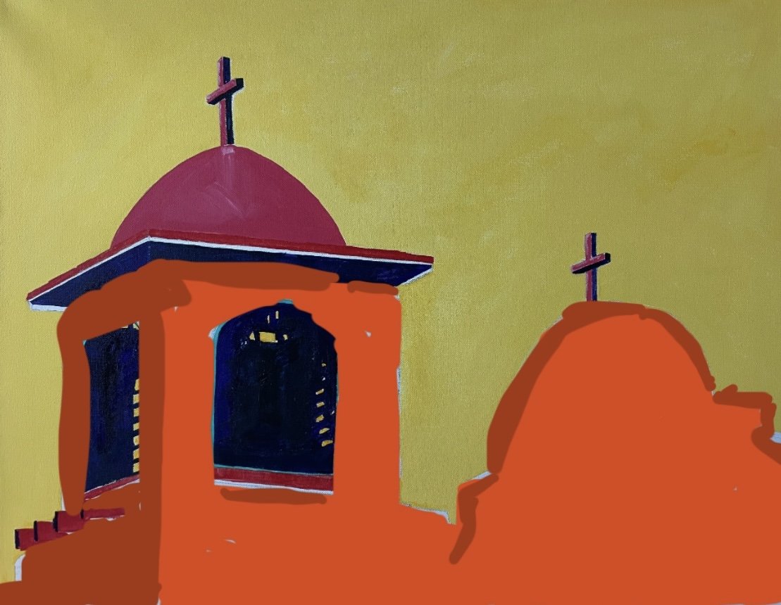
The featured image above comes about from applying the Cutout Style to the original unmodified image. I think it would be neat if the original art was printed as a poster using this style. What do you think? Let me know!
Last week I painted a 11” X 14”original piece on 140# mixed media paper with acrylics, soft pastels, and pencil. It was not planned in advance so I call these pieces non-representational landscapes. The only plan I have is to created a horizontal line across the paper that is located off-center and level for basic orientation.
When the piece was finished I was pleased with the color values and style and enjoyed viewing it as the sun’s daylight faded and the room lights came on one-by-one. It really looked cool in the different light sources which is a basic need for me to keep these type of daily paintings.
Do you ever wonder what a painting could look like in different styles? I do. So, I imported a photo of the painting into Photoshop Elements and played around a little.
The featured image above comes about from applying the Cutout Style to the original unmodified image. I think it would be neat if the original art was printed as a poster using this style. What do you think? Let me know!